
Here Are 5 Reasons Why You Need Responsive Design
We live in a universe of data, where the accessibility of information and the speed of correspondence is critical for practically any business. In this manner, mobile devices that are utilized for feature-rich information should be improved upon in order to work at an optimal capacity. If you are a proprietor of a business with a website, the advantages of responsive design and the reasons why it is an absolute necessity have become paramount. In today’s post, we will explore 5 reasons why you need responsive design.
What is Responsive Design?
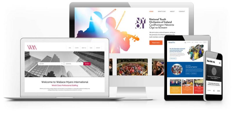
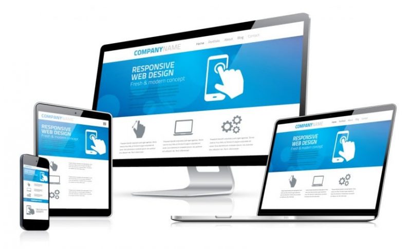
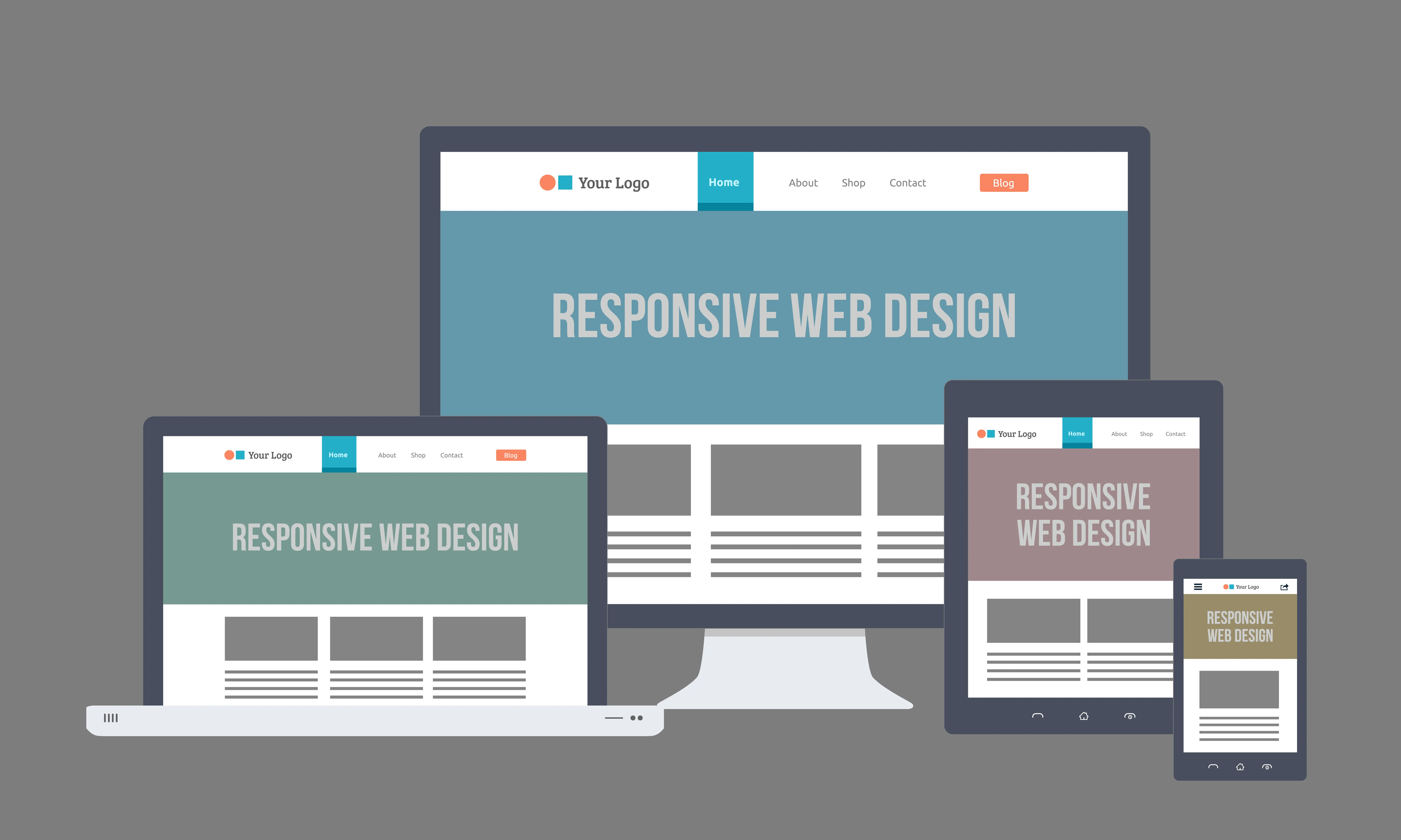
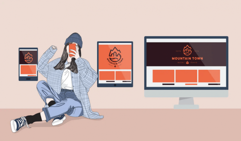
Responsive web design is an approach to web design that places User Experience (UX) at the forefront of importance. A responsive design will adapt to the screen size, device and orientation of each user, creating an optimal UX for desktops, tablets and smartphones. A responsive design does not represent a new technology, rather it represents a new approach to existing technologies. A responsive website is built using a responsive framework, such as Bootstrap and Foundation.
The anatomy of a responsive design can be broken down into 3 components:
…….
Fluid-base proportion grids.
A fluid grid layout determines how the website will be displayed on different screen sizes and devices.
Responsive images.
Whereas traditional websites use images that are based on pixels and therefore fixed height and width, a responsive website use images based on percentiles. This allows the image to adjust itself depending on screen size.
CSS media queries.
A media query is a CSS module that allows content to render based on screen size. Media queries will match the type of device that is requesting the content and the corresponding style sheet will be applied to display the website.
The Emergence of Responsive Design
Specifically, the greater part of worldwide web traffic is being received by means of portable devices. The ascent in utilizing cell phones and tablets indicates that this rate will keep on increasing. Consequently, the differentiation among fixed and portable utilization of the web will turn out to be fundamentally bigger. All in all, why is having a responsive design that significant?
Right off the bat, we have to comprehend what is it utilized for. In particular, contingent upon the device you use to get to your site pages, you may notice that some of them are extremely user friendly and that there are no glitches or trouble dealing with them, instead of others that are not all that simple to utilize and their user experience is terrible. The principle contrast between these two web experiences is the way in which they were built. Traditionally, sites created for cell phones will work perfectly on your cell phone while you will encounter issues on a desktop. A similar circumstance happens when you attempt to visit at a website with your cellphone which has not been produced for this kind of device, hence the photos and the content you are trying to access have all the earmarks of being unreadable. As the web continued to evolve, we came to a crossroad. We needed to find a new way of building websites that would allow for an optimal experience regardless of device or screen size. And thus, the age of responsive design was born.
Let’s Explore the 5 Main Benefits of Responsive Design
1. Lower Development and Maintenance Costs
On account of responsive design architecture, you won’t need to pay for a separate mobile website. Since your page layout adapts to any screen size or device, you will be saved the additional cost of maintaining two separate websites.
2. Improved User Experience
Responsive architecture is a game changer in regards to user experience. Not just in the fact that there will be less unreadable content and images, but the overall navigation and site flow will be greatly enhanced. Site visitors will know intuitively where to go and without the need for zooming and panning.
3. Flexible Website Management
We have discussed how features are bound together to introduce the unrivaled experience of responsive design for site visitors. But the advantages of responsive design carry over to website administrators. With a responsive website, administrators are spared the rather annoying task of duplicating content to fit different screen sizes and devices. The time you save by utilizing the advantages of responsive design allows you to place your limited resources into other areas of the business.
4. Better SEO results
When Google suggests something, you need to listen. As responsive design has demonstrated a better overall user experience, Google has updated their search algorithms to include responsive design as a critical factor in determining website quality and search rankings. In addition, by installing Accelerated Mobile Pages (AMP) to your website you will be improving your position on Local SEO.
5. Decreased Bounce Rates
Bounce rate is defined as the percentage of site users that leave your website after visiting just one page. A high bounce rate is frowned upon by Google, and your organic search results will suffer as a result. By providing a better overall user experience, responsive design should lead to a lower bounce rate and increased search results.
Conclusion
When considering all the benefits of responsive web design it is not difficult to understand why it is an important approach to web design and why your website needs to employ it. Not too long ago, a responsive website gave a business a competitive advantage as the approach was still new and used on relatively few sites. But in 2020, responsive design is ubiquitous and has become a best practice in website development. Neglecting to engage in responsive design for your website will result in lost customers and lower sales.
D E E P B L U E Knows the Market

DEEPBLUE is a San Francisco web designer that delivers measurable results. Learn more about our responsive web design services and contact us to schedule a complimentary needs-assessment consultation.
When it comes to these hot new trends, the team here at DEEPBLUE is ready and willing to use them when designing your site. In fact, many of the new trends follow the work we have completed, making us proud web design trendsetters. If you want to get your hands on a site that is innovative and designed beautifully then give us a call, we’d love to work with you.
