
Journey Through Spacetime and Black Holes for A Brief History of Web Design
In the beginning, there was Sputnik.

At the height of the Cold War, the Soviet Union shocked the world when it successfully delivered the first man-made satellite into low Earth orbit on October 4, 1957. While weighing in at a mere 187 pounds and lasting 21 days before falling back to Earth, this tiny little sphere with the ominous “beep… beep… beep” was enough to send the United States into a full panic over fear of intercontinental atomic war. Born soon after, the Advanced Research Projects Agency Network, or ARPANET.
The ARPANET was created to distribute digital resources across a range of computers and geographical locations, making the network decentralized and able to maintain efficacy even in the event of nuclear bombardment. The ARPANET was the pioneer in what would eventually become the Internet, launching the Information Age.
Thank You, Sir Tim Berners-Lee

For many years, the Internet was accessible mainly by academics and government agencies and was not considered for its potential as a commercial platform. Personal computers became commonplace in the 1980s, but data was mostly confined to the specific machine. It was around this time that the first commercial modems began to appear, allowing users to connect their computer to other computers using traditional phone lines. This began the dark ages of the Internet with painfully slow connection speeds and limited data access.
It was in the early 1990’s that a pioneer in communications named Tim Berners-Lee developed what would become known ubiquitously as the World Wide Web. Berners-Lee developed HTML: HyperText Markup Language, which is the formatting language for the web. The World Wide Web (WWW) allowed users for the first time to access other computers using a web browser, thus the modern web was born. The very first link went live on August 6, 1991. Here it is:
http://info.cern.ch/hypertext/WWW/TheProject.html
History of Web Design. The Birth of the Commercial Web.

It did not take long for corporations to take notice of this emerging commercial platform and try to capitalize on it. Companies began building “websites” that allowed users to visit a virtual marketplace, accessing information regarding products and services. As grand as the promise for what the web would become, early websites were basically glorified brochures.
Here is Apple’s first website:

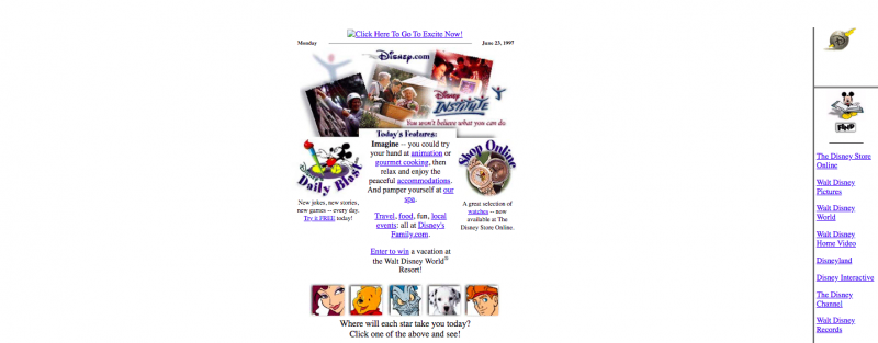
Here is Disney’s first website:
Here is Coke’s first website:

History of Web Design. The Evolution of the Web.

By the late 90’s, websites began to come into their own. The web represented an entirely new platform, different than other mediums such as print or television. Web developers began to understand its potential and set out to create interactivity. Designers started to place more focus on aesthetics and overall appearances. Animations began popping up, much to the annoyance of many. Adobe Flash soon emerged as a dominant language, allowing for immersive interactive experiences that were never before seen. Web specific languages, such as PHP, began to appear. With no standards established for either web developers or technology providers the era quickly became known as the Wild Wild West.
Soon, hotel reservations, airline tickets, books, cd’s, etc. could be purchased online. Prospective students could tour virtual campuses and apply online. The growth of remote learning and remote working began to proliferate. An entire generation of telecommuters was born, and with the added benefit of wearing pajamas at work.
History of Web Design. The New Millennium.

By the early 2000’s, the web was rapidly growing into a mature platform. New technologies continued to evolve and shape the very definition of what a website could be. Web design was no longer looked upon as simply a technical matter, but a creative one as well. The advent of Cascading Style Sheets, or CSS, allowed for the separation of code and content and opened up the doors to web design as a career for many young creatives. Web designers had much greater control over the appearance of their work, and the concept of “pixel-perfect” became a philosophical staple. Of course, at that time websites were only designed for desktops and laptop computers, so the challenge of creating for relatively similar screen sizes was not difficult.
With the emergence of broadband connections, faster computer processors and high-definition monitors the website canvas grew larger. The term “Web 2.0” was thrown around with more interactive features and more immersive user experiences. But this was just the beginning.
History of Web Design. The Mobile Web & Responsive Web Design

By 2010, millions of people began to experience a rich user-interface and seamless access to the web and all its bounty – websites, movies, music, news, etc. – from their phones. Thanks to Steve Jobs, the smartphone became the one device that practically every person on the planet had in their pocket. By the end of 2010, over 63.2 million people accessed the web on their mobile device on a daily basis.
This shift from desktop to mobile in the platform landscape required fundamental changes for web designers, both technically and philosophically. Enter Responsive Web Design.
A responsive website is an approach to web design that places User Experience (UX) at the forefront of importance. A responsive website will adapt to the screen size, device and orientation of each user, creating an optimal UX for desktops, tablets and smartphones. A responsive website does not represent a new technology, rather it represents a new approach to existing technologies. A responsive website is built using a responsive framework, such as Bootstrap and Foundation.
A responsive website responds to the specific environment of the user. The emergence of responsive web design has made the practice of developing separate, “mobile-friendly” versions of a website obsolete. In addition to a better overall user experience and less maintenance required, responsive websites are search engine-friendly. In recent articles, Google and Bing have tapped responsive web design as their preferred method for building a website that will be visited by any source of mobile traffic; which is any website that exists in today’s world.
History of Web Design. Web & Accessibility Standards.

In 1994, the aforementioned Tim Berners-Lee founded the World Wide Web Consortium, or W3C. The W3C is an international organization comprised of academics, government agencies and technology corporations with the aim to establish a universal set of web standards for web developers to follow. In 2012, global organizations jointly signed the Open Standards Principles agreement in the effort to improve the way people around the world develop and use web technologies. For the first time, the standards set forth by the W3C established a common methodology and developer tool kit used in designing websites.
The Americans with Disabilities Act, or ADA, was created by congress as a supplement the Civil Rights Act of 1964, which outlawed discrimination based on race, color, religion, gender or national origin. ADA-compliance was created to protect individuals with disabilities from discrimination and to ensure accessibility. In the real world, this applies to the physical accommodation to businesses as building construction and alterations must comply with ADA design standards in order to meet ADA-compliance. While most of us are familiar with these requirements, many of us might be surprised to learn that the same standards apply to the digital world, in particular websites. The standards are to ensure that people with disabilities are able to access content to a website with the same convenience as people without disabilities. As a business, government agency or non-profit organization, you are compelled by the law to remove any technical obstructions that may discriminate against people with disabilities. Failure to comply with ADA design standards may result in fines or even a lawsuit.
History of Web Design. WordPress and the Open Source Movement.

By 2010, WordPress emerged as the most popular content management system in the world. From its humble roots as a simple blog, WordPress evolved into a powerful and intuitive tool for businesses, nonprofits and government agencies alike. Built in PHP, WordPress is an open source platform that is available to anyone that wants it. This is in stark contrast to the traditional, proprietary .NET platforms that preceded it. In addition, WordPress is absolutely free whereas proprietary platforms require absurdly expensive license agreements.
History of Web Design. Today’s Web Design & Future Trends

The web has evolved very quickly to bring us to today’s modern web experience. With responsive web design, we enjoy visiting websites on any device, including desktops, tablets and smartphones. We benefit from a user experience that is optimized for each device. Technologies such as JavaScript and CSS configure browsers specifically for the hardware it’s running on. HTML is now in its 5th iteration and has aided in creating page designs that work with any content. Technology is converging. Web design has simplified to provide an elegant, cross-platform experience. The distinction has blurred between a website and a mobile application. 5G wireless networks are taking root across the world with the promise of ever-faster connection speeds and the Web of Things looming on the horizon. Open source and better software efficiencies have lowered the cost of website development. Today, more than ever before, web designers have the freedom to express their full creativity and technological wizardry.
D E E P B L U E Knows the Market

D E E P B L U E is a Bay Area web design company that delivers measurable results. Learn more about our web design services and contact us to schedule a complimentary needs-assessment consultation.
When it comes to these hot new trends, the team here at D E E P B L U E is ready and willing to use them when designing your site. In fact, many of the new trends follow the work we have completed, making us proud web design trendsetters. If you want to get your hands on a site that is innovative and designed beautifully then give us a call, we’d love to work with you.

